Introducing design thinking process to solve an ambiguous problem for a legacy organization.
MoneySense is one of Canada's most loved personal finance magazines since 1999. Since Rogers discontinued its print version in 2016, the website has been through many changes. When I was brought on to this project, the site has just been redesigned by a previous agency and the stakeholders were already dissatisfied with it because "it looks dated, and I hate that green." Yikes.
To tackle this ambiguous problem, I've kicked off a research process that looked at users, business and brand needs. After a series of workshops and user interviews, we ended up with a MVP proposal and a design system that set this legacy magazine on the right path.
I knew that MoneySense needed a solution that lasts so that the team can stop churning designs and focus on doing what they do best - creating quality financial content for Canadians.
Therefore, my goal was to help define the problem create a proposal that captures the following:
the needs of Internal Users (editors & writers)
the needs of External Users (readers)
the needs to generate revenue
the legacy of our print heritage
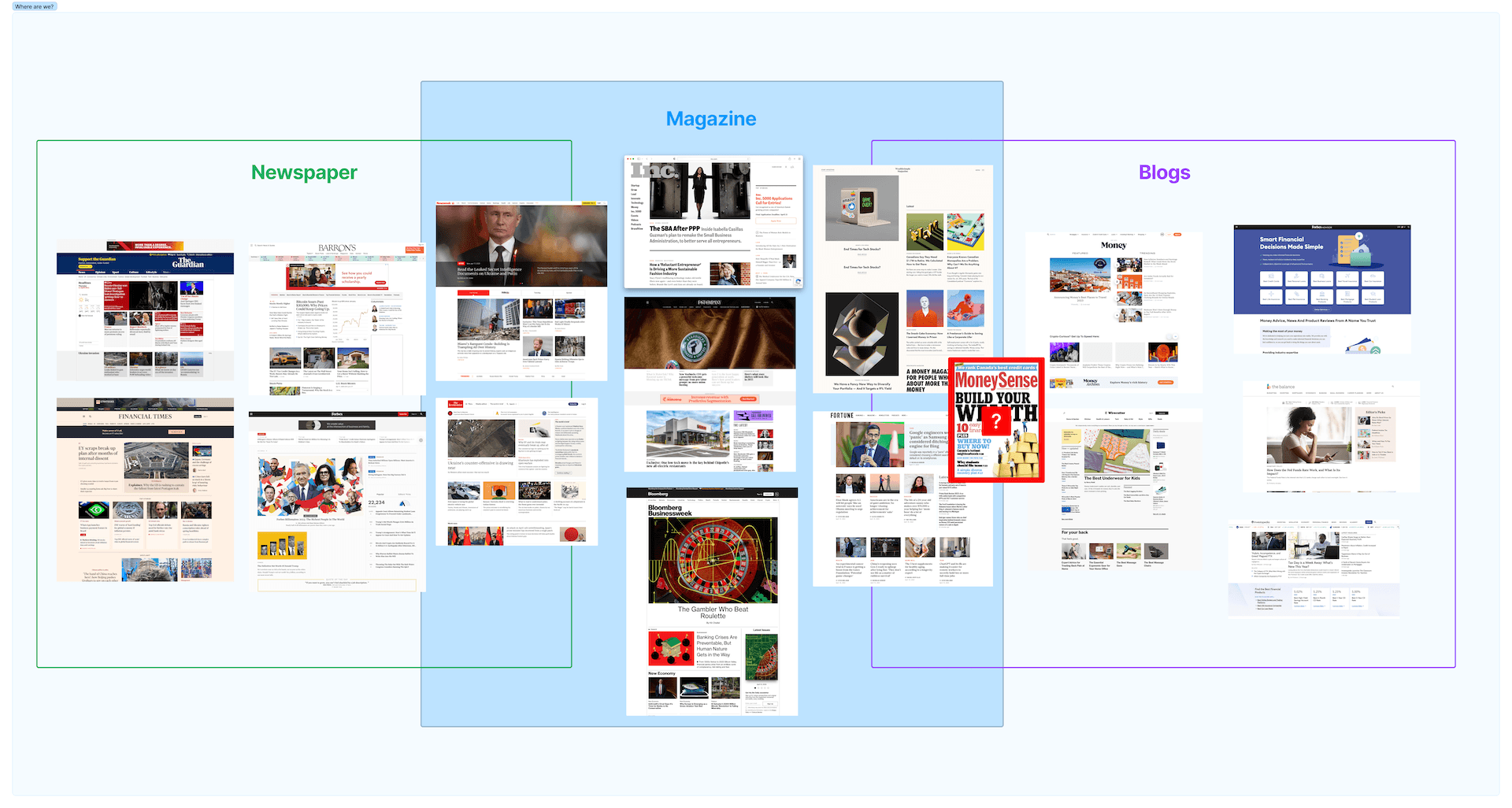
While MoneySense's SEO game is strong, the key question is how can we differentiate ourselves among news sources like Yahoo Finance, Financial Times and Forbes or blogs like Money.com, Balance and Investopedia.
I interviewed 10 financial news consumers to gain insights into their financial content consumption habits and their perception of MoneySense. Here's what I learned:
What MoneySense is
a reliable source of financial information written by reputable authors
Canadian content
where users go to learn more about finance topics
where users get curated recommendations for financial products
What MoneySense is NOT:
a newspaper website
a website "that sells financial products" like NerdWallet or Ratehub.ca
as known and trusted in comparison to Forbes, Yahoo Finance, Globe & Mail Finance, CBC News
What users expect to see from MoneySense
a better reading experience on mobile devices (over 50% access it via phone)
a better way to organize long form content
a clear distinction between editorial articles and product recommendations/monetized content
trustworthiness and transparency regarding partner content

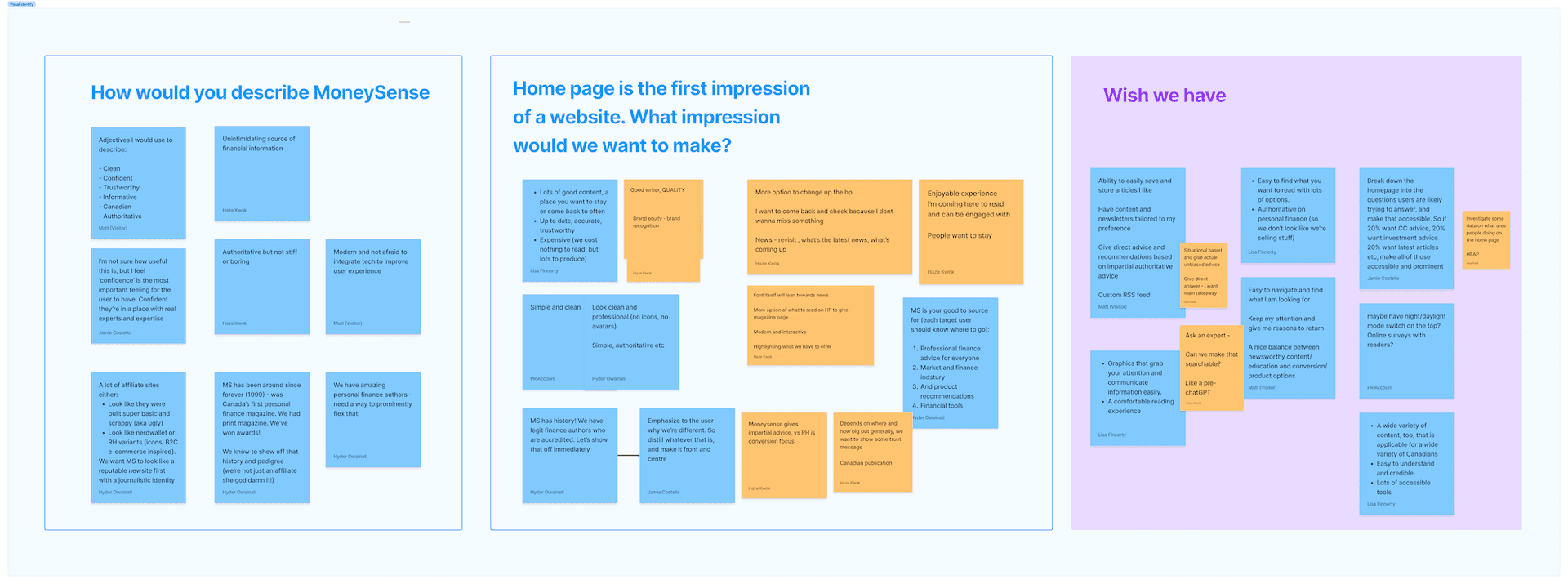
What the business needs:
A flexible way to organize content by category. Some categories have more content on a weekly basis than others.
A way to generate revenue via featured products and sponsored pages
Convey transparency, trust and authority
Don't mess with SEO
I gathered a few old print versions of MoneySense magazine and I was in love with the illustrations and the playful layouts. Though it dealt with a topic that could be dry but MoneySense magazine felt energetic, bold yet authoritative. I was looking for ways to bring these elements to the website.

With the research above, we've identified the following key goals
Shorten the page without shortening the content: Better reading and navigating experience so that our readers can better digest long form content
Monetize with transparency: Clearly distinguishing monetized and non-monetized content so that users can make their own informed decision when choosing financial products on MoneySense.
Flexible layout CMS: Provide a flexible way for editors to showcase articles by category and by features.
Modernized a legacy: Present MoneySense to the next generation of readers while preserving our print legacy.
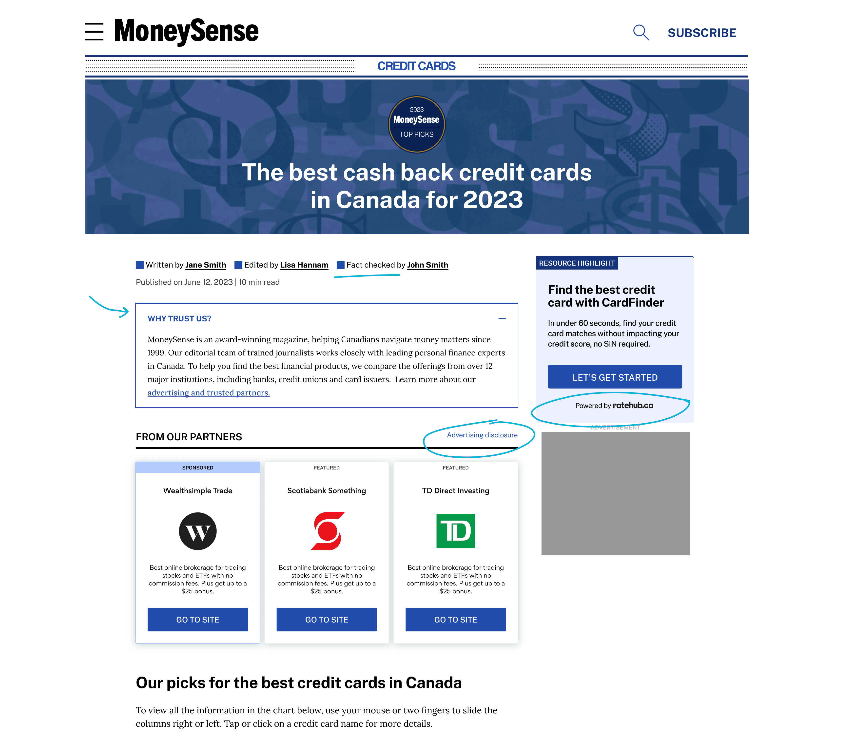
Page navigation features like accordion and table of content overlay can help shorten the page by hiding some content that users can click to expand.
A carousel section labeled "Resources & Tools" showcases only product recommendation content with custom illustrations helping to differentiate monetized articles from editorial ones.
This helps users focus on the kind of content they want and also allows editors to feature prominently high converting content when needed.
Monetized content is presented alongside our advertising and editorial policy, providing transparency to users.
Monetized products are clearly marked, enabling users to make informed decisions.
The implementation of the 'Why Trust Us' accordion increased user clicks to monetized products by 12%.
The introduction of a hamburger menu unified the user experience across mobile and desktop platforms, giving the site a modern look and simplifying navigation.
Usability testing confirmed that users could easily navigate the site using the new menu.
We built components that allow a flexible configuration of article cards.
Editors can arrange and set feature articles based on the editorial need of the week without requiring any developer resources.
Conduct usability tests one component at a time
Most decisions made in this redesign resulted from numerous small A/B test experiments. Components such as the hamburger menu, 'Why Trust Us' accordions, and sponsored product cards underwent A/B testing on the old website before being incorporated into the redesign.
When in doubt, run a workshop
When the project has been labeled "a mess" and people are generally unhappy about the state of things, it's up to the designer (a.k.a. master of empathy) to lead everyone to take a step back and go through a design thinking process. It's best done in person with post-it notes and fun, colourful pens. We all crave a sense of play behind our screens.
Collaborate often and conduct UAT early
When building something entirely new, such as a whole new website with new features, frequent working sessions with developers are essential. What was written in spec often required adjustments in real life, especially with responsive elements.
Design system is a living document
Creating this design system was a journey. I found myself making corrections along the way as new components surface so that they are designed to be as future-proof as possible.