Data visualization

Data visualization

Data visualization

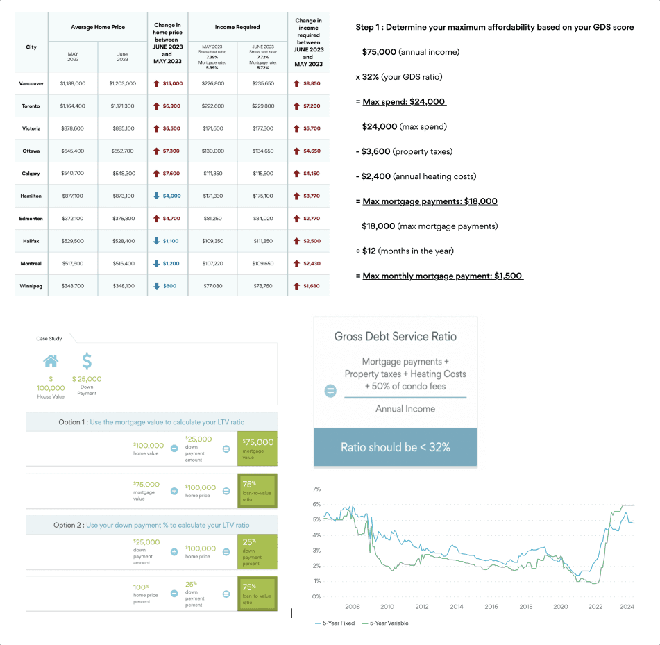
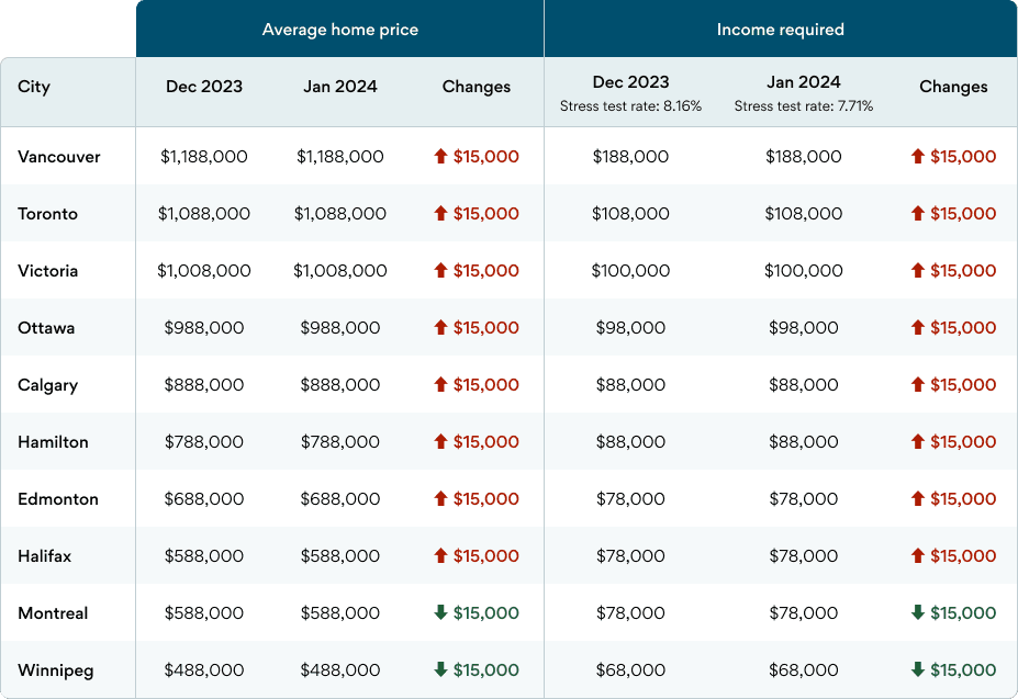
How I turned Ratehub's HTML tables into reusable data visualization components

The challenge

In the Ratehub.ca design system, tables and formulas are considered especially heinous. In "can you do a mock up" city, the dedicated designer who investigates these vicious felonies is a member of an elite squad known as the special victim who has been chosen to turn all of Ratehub's educational content into responsive components. This is her stories. Dun dun.


In case it was not clear, this is a reference to Law & Order SVU from this geriatric millennial.

The before

The before

The before

Ratehub.ca's mission is to help Canadians make better financial decisions and its education centre offers some of the most comprehensive explanations of complex financial key terms. However, due to neglect, all of their data tables were not responsive and had not been updated since the early 2000s.


It had a negative impact on users being able to comprehend the data on difference devices and it affected our credibility as a brand.

The after

The after

The after

The majority of the effort was thinking about ways to present data on a mobile device. There were many iteration of approaches: asking the users to tilt their phones, shrinking it, wrap and stack, adding a scroll bar, removing the whole thing using media query, or just let them use zoom.


The below were our best MVP approaches, it will take more testing and iterations to determine which methods work best.

Large data table with horizontal scroll on mobile

Large data table with horizontal scroll on mobile

For data tables that have more than 3 columns, a scroll bar will appear for mobile sized screens. The first column is frozen so users can browse the row's data while keeping the data labels in view.

For data tables that have more than 3 columns, a scroll bar will appear for mobile sized screens. The first column is frozen so users can browse the row's data while keeping the data labels in view.

Line graphs with data selection

Line graphs with data selection

By adding check boxes in the legend, users are able to compare multiple provinces' data at the same time. On mobile devices, the selection tool becomes a drop down menu so we can maintain comfortable hit target size for the check boxes.

By adding check boxes in the legend, users are able to compare multiple provinces' data at the same time. On mobile devices, the selection tool becomes a drop down menu so we can maintain comfortable hit target size for the check boxes.

Other tables and formulas

Other tables and formulas

Haze Kwok | hazehei@gmail.com | 647.739.3834

Haze Kwok | hazehei@gmail.com | 647.739.3834

Ratehub.ca's mission is to help Canadian make better financial decisions and it's education centre offers some of the most comprehensive explanation of complex financial key terms. However, due to neglect, all of their data table are not responsive and has not been updated since the early 2000.


It has a negative impact on users being able to comprehend the data on difference devices and it affects our credibility as a brand.

The majority of the effort was thinking about ways to present data on a mobile device. There are many approaches, asking the users to tilt their phones, shrinking it, wrap and stack, adding a scroll bar, removing the whole thing using media query, or just let them use zoom.


The below were our best MVP approaches, it will take more testing and iterations to determine which methods work best.

Large data table with horizontal scroll on mobile

Graph display with data selection

Other tables and formulas

Haze Kwok | hazehei@gmail.com | 647.739.3834

Haze Kwok | hazehei@gmail.com | 647.739.3834