Landing page optimization
Landing page optimization
Landing page optimization
How I redesigned a credit card landing page and increased lead conversion by 17%.
Overview
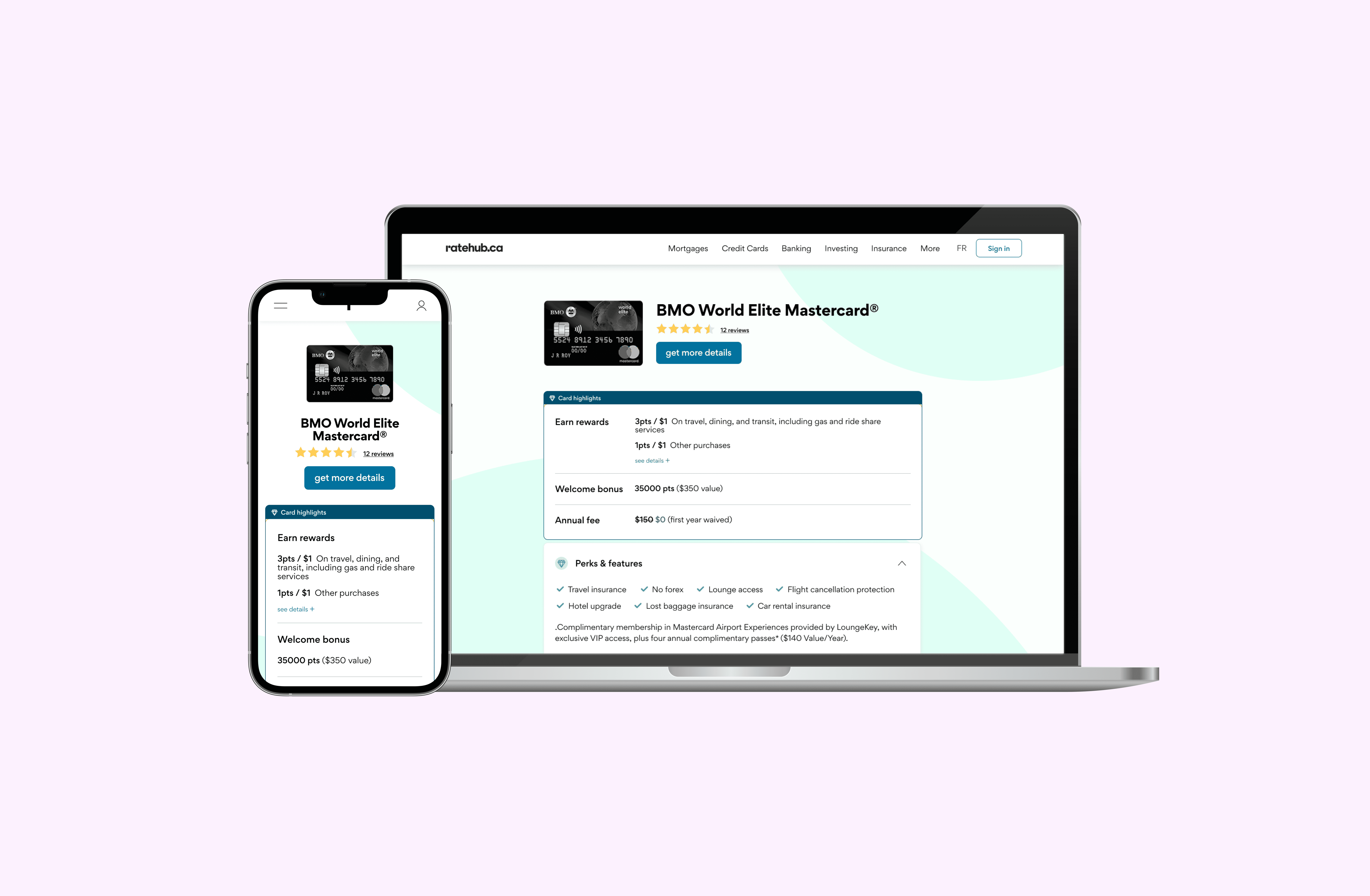
Credit card listing pages like the below rank extremely well for Ratehub.ca because of its keyword-rich content ideal for SEO. However, it's clear that the overwhelming amount of information is not fit for human consumption. The goal of this project was to create a more user-centric design that increases lead conversion.
The launch of this iteration resulted in a 17% increase of lead conversion rate and the feature successfully shipped as a result.
The research process
The research process
The research process
Conduct user interviews to understand current pain points
Conduct user interviews to understand current pain points
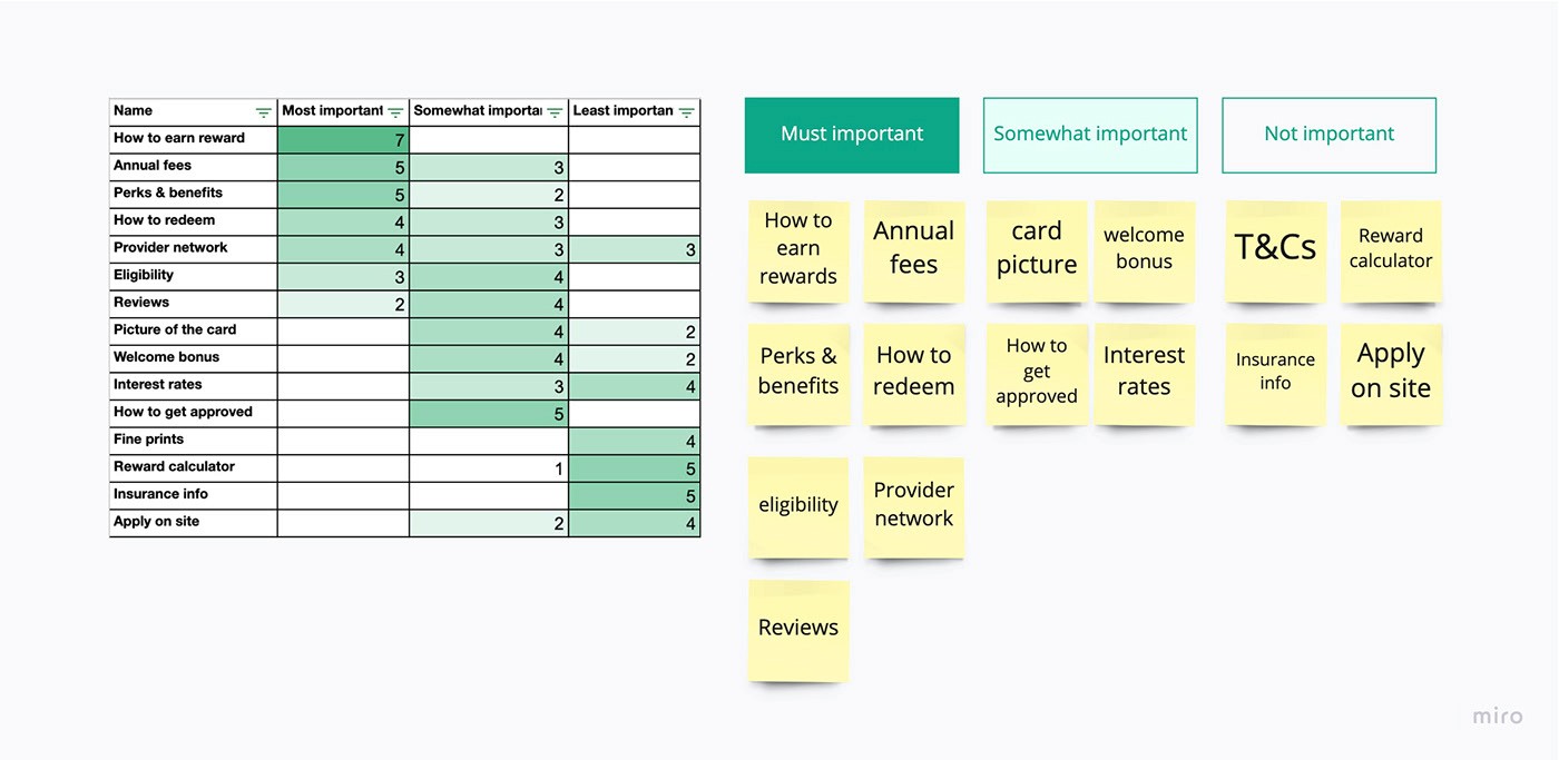
Use card sorting to understand decision hierachy
I recruited 10 credit card searchers and conducted moderated interviews to get an idea of what they think about the current page and what pieces of information are the most important to them.

Key insights
The calculation of the reward number was not found to be important in user interviews. Instead, users wanted to know:
How do I earn points?
What perks can I get with the points?.
How do I redeem the points?
Key insights
A mismatch between what the users really care about and what the page is showing
Users are unclear where clicking the CTA button will take them
Too much information and the amount of text is overwhelming
Key insights
A mismatch between what the users really care about and what the page is showing
Users are unclear where clicking the CTA button will take them
Too much information and the amount of text is overwhelming
Noticing that we lacked understanding of our users decision criteria, I had my participants sort these topics into level of importance for their decision making. This helped inform me how best to use the real estate of the page and make some big decisions to rearrange content in a way that is helpful.
Use card sorting to understand decision hierachy
Noticing that we lacked understanding of our users decision criteria, I had my participants sort these topics into level of importance for their decision making. This helped inform me how best to use the real estate of the page and make some big decisions to rearrange content in a way that is helpful.
Key insights:
The calculation of the reward number was not found to be important in user interviews. Instead, users wanted to know:
How do I earn points?
What perks can I get with the points?.
How do I redeem the points?
Job to be done
Job to be done
Organize informations in a way that highlight only the most important decision making factors, so that users can get exactly the information they're looking for with least amount of effort.
Test results
80%
Users prefer the winner design
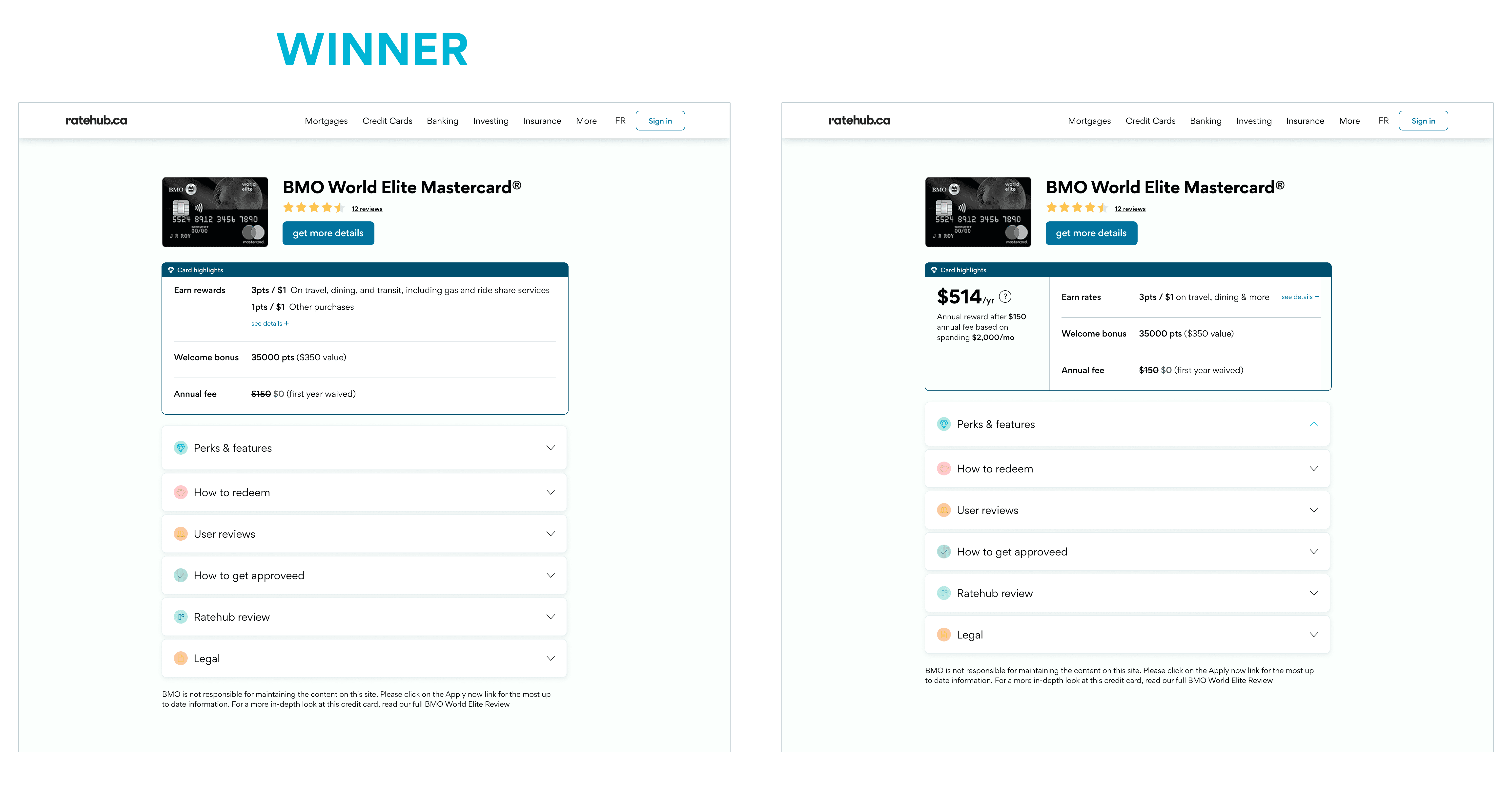
The reward point breakdown is clear and up front, answering the question "how to earn rewards?"
Users are skeptical of how the $514 number is calculated. This increased cognitive load.
One key feedback was that users wanted to see more card perks immediately.
When I presented my findings, I received some resistance from the business stakeholders about removing the reward calculation on the top. They felt strongly that it's a unique brand feature and it had received anecdotal positive feedback in the past especially on comparison charts.
What I did to navigate this:
I explained that the user needs are different at different stage of their research. While numerical calculation has been an excellent feature in a comparison chart, the user has landed on this particular page because 1) they want to look into the details of this card in particular, 2) they've landed here from a comparison chart, therefore the JTBD for this page is not the same as a comparison chart.
I offered to conduct a prototype test with 2 versions of the page to see if users prefer the version with the reward number or not.
Because of the controversial nature of this test, I over-communicated my approach and shared a few designs with them to arrive at one that everyone aligned with.
Preference test
I set up a preference test with 20 users and set them up in a scenario where they have chosen this card from a comparison table on Ratehub. Then I showed them the following 2 designs in alternating orders (to reduce bias) and asked them which one they prefer and why.
MVP launch
Advocating for the user's point of view
Advocating for the user's point of view
Advocating for the user's point of view
When I presented my findings, I received some resistance from the business stakeholders about removing the reward calculation on the top. They felt strongly that it's a unique brand feature and it had received anecdotal positive feedback in the past especially on comparison charts.
What I did to navigate this:
I explained that the user needs are different at different stage of their research. While numerical calculation has been an excellent feature in a comparison chart, the user has landed on this particular page because 1) they want to look into the details of this card in particular, 2) they've landed here from a comparison chart, therefore the JTBD for this page is not the same as a comparison chart.
I offered to conduct a prototype test with 2 versions of the page to see if users prefer the version with the reward number or not.
Because of the controversial nature of this test, I over-communicated my approach and shared a few designs with them to arrive at one that everyone aligned with.
Preference test
I set up a preference test with 20 users and set them up in a scenario where they have chosen this card from a comparison table on Ratehub. Then I showed them the following 2 designs in alternating orders (to reduce bias) and asked them which one they prefer and why.
Test results
80%
80%
Users prefer the winner design
The reward point breakdown is clear and up front, answering the question "how to earn rewards?"
Users are skeptical of how the $514 number is calculated. This increased cognitive load.
One key feedback was that users wanted to see more card perks immediately.
MVP launch
MVP launch
Result & learnings
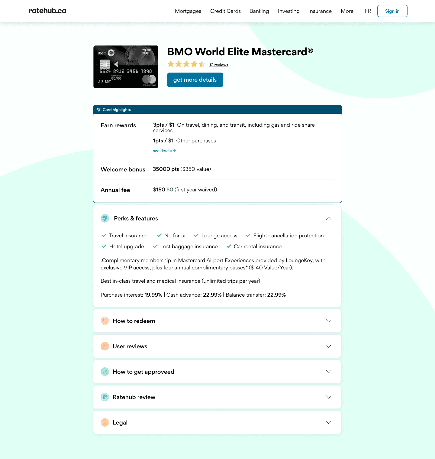
The MVP page was A/B tested with 50% of real users who visited the page.
Lead conversion rate increased by 17%
SEO ranking was not affected
17% +
Lead conversion rate
Resolving disagreements with real data
It's common that findings from user research contradicts stakeholders assumptions. When that happened, I find it helpful to communicate throughly and frequently to give the stakeholders a sense that they're actively involved in the whole process and we were not making any rogue decisions without their alignment. Working with my PM to create a thorough MVP test plan with limited amount of users at first also gave stakeholders the reassurance that we can reverse course should things go wrong. At the end of the day, an A/B test with real conversion data was the best way to make the final call.
The MVP page was A/B tested with 50% of real users who visited the page.
Lead conversion rate increased by 17%
SEO ranking was not affected
17% +
Lead conversion rate
Result & learnings
Result & learnings
The MVP page was A/B tested with 50% of real users who visited the page.
Lead conversion rate increased by 17%
SEO ranking was not affected
17% +
Lead conversion rate
Resolving disagreements with real data
It's common that findings from user research contradicts stakeholders assumptions. When that happened, I find it helpful to communicate throughly and frequently to give the stakeholders a sense that they're actively involved in the whole process and we were not making any rogue decisions without their alignment. Working with my PM to create a thorough MVP test plan with limited amount of users at first also gave stakeholders the reassurance that we can reverse course should things go wrong. At the end of the day, an A/B test with real conversion data was the best way to make the final call.